Palo Alto Networks | Events
Cutting edge cybersecurity events calls for a cutting edge events page. When Palo Alto Networks wanted to update their events page, we re-designed the page experience to better reflect their expertise and offerings.
BEFORE:

Where’s all the events?
The original layout of the site experience didn’t offer much above the fold, save for a single featured event.

A needle in a card stack
The original filter system was difficult to understand (what does “Ascending” even mean?) and lacked the specificity needed to manage PAN’s offering of live events, virtual events, and library of on-demand material.

Does this spark joy?
While offering helpful details, the card design system made for a cluttered look that made it difficult to scan options quickly.

See something you don’t like?
At the bottom of the site experience, this section attempted to offer up curated collections of content. However, the cards were vague and lacked visual interest.

AFTER:
Maximize, maximize, maximize.
We replaced the single event feature hero with a hero carousel to show off a range of PAN’s featured events and maximize the space above the fold.

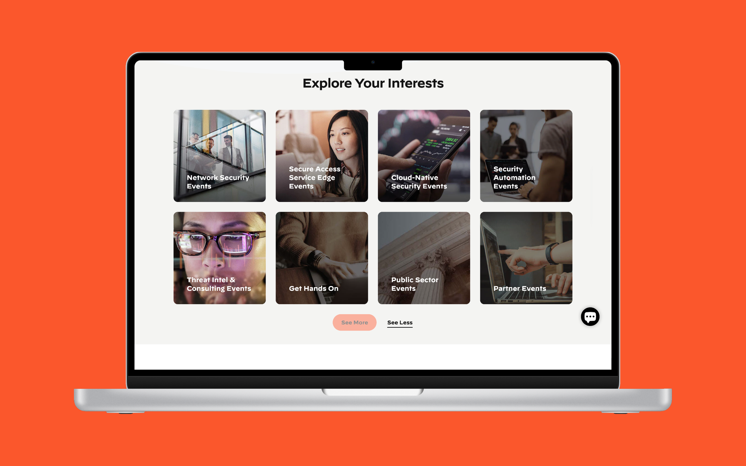
Curated Collections for the Curious
Instead of thinking about curated collections as an afterthought, we serve up visually striking selections of content and events in a space-saving four-up that expands to show off up to eight custom content categories.
Putting the Responsive in RSVP (I know this pun doesn’t work)
We completely overhauled the card design system and the event filter system to give users more options for how to sort through PAN’s comprehensive offerings and get to what they need to keep them on the cutting edge.


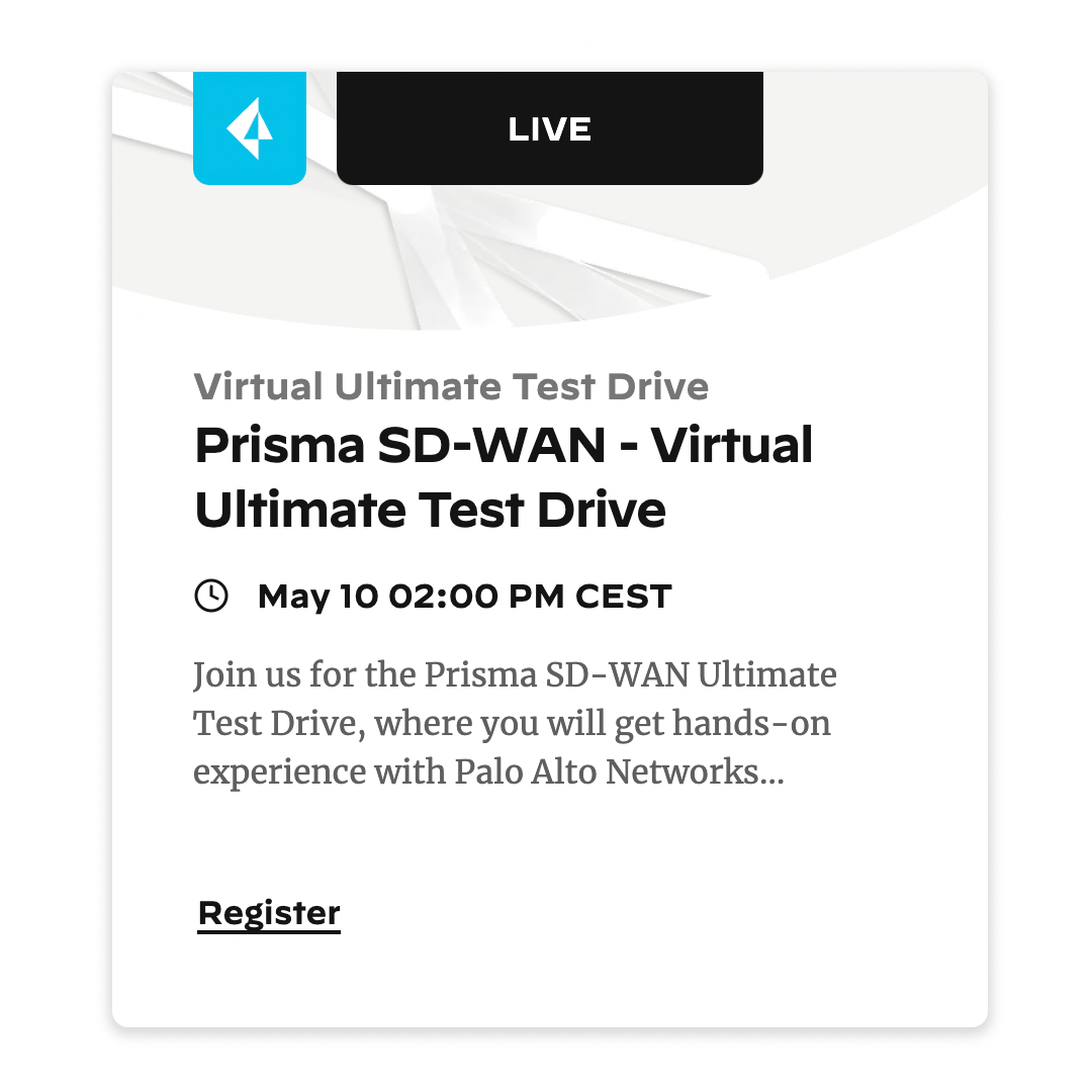
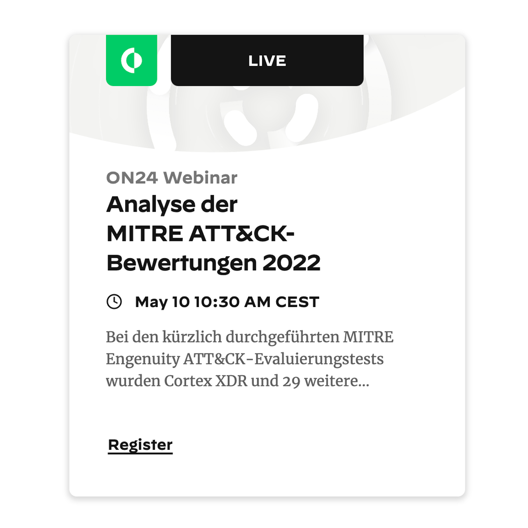
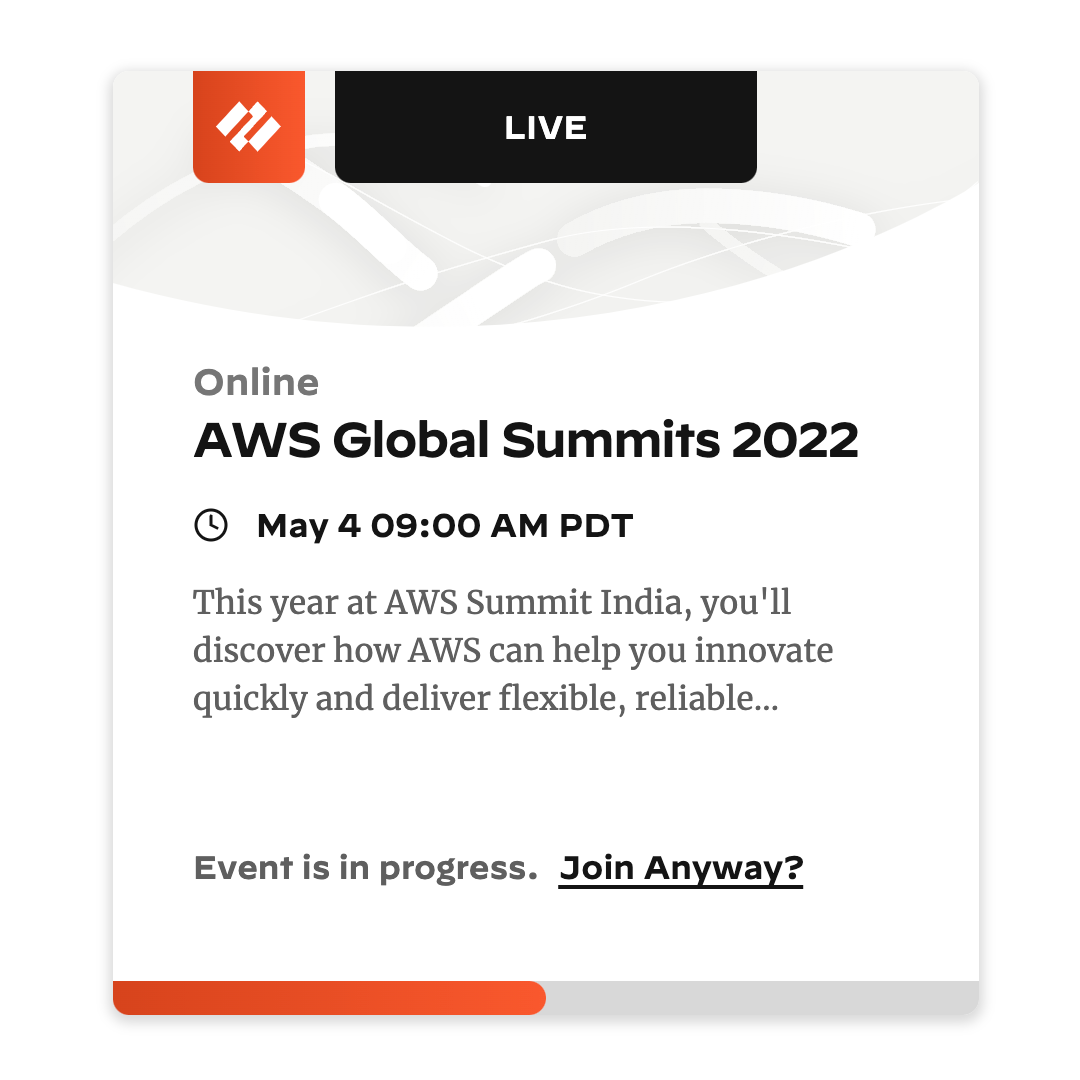
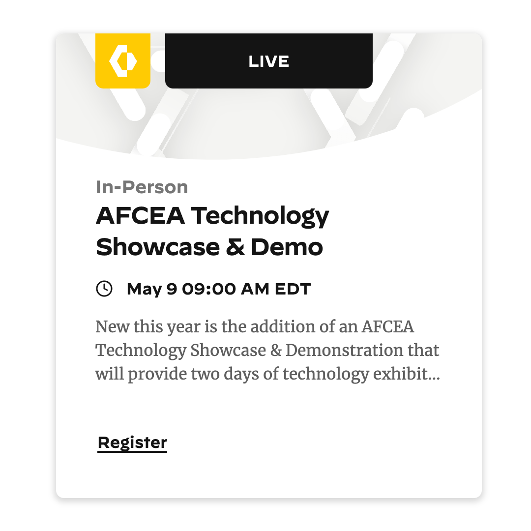
A Love Letter to Card Systems That Work
Here’s some things we did to make the card system work:
We removed the color from the product-branded illustrations and instead kept the color to product icon tabs on the cards. We also added a filter to search by product names and product type, instead of relying on users being familiar with PAN’s product names.
We re-did the layout of the text and information fields on the cards to give them a clearer information hierarchy and make them more easily scannable.
Instead of an unwieldy visual hashtag indicator to show if an event was live or on-demand, we made a label tab at the top of the cards and added a live/on demand toggle to the filter system.